Inter face design is found everywhere, whether yo notice it or not. A user interface is an interaction between two objects, specifically a human interacting with a digital object such as a computer. How good a interface design is depends on a range of different things, the designers personal preference for starters, some people prefer things that others might not so this could cause a problem as people might not like what the designer thinks is good. A good example of this would be the Mac os and window's os as some people prefer the macs os and others prefer the window's os.

Although the window's os was made 13 years ago its still one of the most popular os even though new os such as the mac are being made, this is because it is commonly updated so its does not get outdated. The window's and mac os are both similar in terms of popularity and there approach to usability is completely different. One of the best features of the window's os would be the start button in the bottom left, its also a visual cue so people understand what it is without having to think about it too much. From the start button, the user can browse all the programs and files on their computer. There is also a search bar at the bottom where they can instantly access what they are looking for by typing it or a keyword relating to it into the search bar. A similar part of the Mac os would be the spotlight feature, which is the macs version of a search bar. The spotlight is harder to identify as a search bar than the windows os version as it is a small icon in the top right corner of the screen with no description, this requires the user to figure it out how it works them self. Although it's more complicates than the windows version, once a user has got the hang of it, they can then uses it to find files and folders quicker and more accurate than the windows search bar. Overall both search bars help save a significantly large about of time finding files and opening software that's on the hard drive. In the end both user interfaces are greatly designed and user friendly, so it all comes down to personal preference. In a review by "Adrian O`Connor" on why Mac os is better than windows he stated
"Windows Search is a resource hog. A real resource hog. Spotlight doesn't consume 1.3GB of memory on my Mac, whereas Windows Search does on my workstation." He favoured the spotlight not just because it was faster, it was because it did not take up as much memory as the windows search bar did on his hard drive. From this I would conclude that people prefer the faster option and the one that takes up the least amount of memory on their hard drive.

visual cues are a great example of the metaphor principle in interface design. visual cues are a symbol used by designers to relay a message to the users with out using text and not using as much digital space. Also using a visual cue on buttons makes it easier for users to understand what the button does with out having to read instructions, this means they don't have to think about it. If the users does not have to waste time thinking about what each button does they will find the product more satisfying as it simple and easy to use and not time consuming. For example the eject visual cue is a good example as it is known world wide as the eject button is used on computers, DVD players and consoles so it is common knowledge what it does and no text is required.


An interesting interface commonly used in today's society is the PS3 dashboard and the Xbox 360 dashboard. Both interfaces are very different and unique, which has lead to the debate over which one is better. The interface for the Xbox 360 dashboard has change a few times over the years, changing the style and giving it a new look. this keeps the user interested and prevents the from getting bored, which is a very intelligent design principle. the way PS3 applied this design principle was by giving the user the freedom to change the theme and customize the icons. Using the PS3 web browser users are able to download thousands of different themes created by other users and apply them to there dashboard. Also the PS3 dashboard is less complicated than the Xbox 360's dashboard and easier to find stuff your looking for, on the other hand on the Xbox 360 the text is a lot easier to read. In my opinion the Xbox 360 dashboard is better as it has brighter colours and feels more friendly than the PS3 and the custom avatars add more life to it.

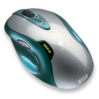
Computers are controlled by a mouse and keyboard. So the user uses the mouse and keyboard to interact and control the computer, the feedback from the mouse is the movement of the courser. The mouse has a mouse ball or a laser sensor on the bottom of the mouse to detect the movement and move the courser on screen. Before the laser sensor was introduced. The mouse would use a ball to track the movement, the mouse ball would work fine until the mouse got dirt in the bottom. Once dirt got in the mouse it will become in-precise and the courser on screen will be wobbling all over the place and become very irritating. This can happen with the laser sensor mouse, however, not very often. Even though the sensor mouse is more responsive than the ball mouse, the ball mouse is better for uneven and rough surfaces as the sensor is less efficient when not on flat surfaces or a mouse mat. The mouse has two buttons, left click, right click and a mouse wheel in the middle. The design of the mouse is just perfect as it comfortably fits in to the users hand and the buttons are easy to click as they are right under the middle and index finger not causing them to move to press the button, not causing any stress. The left button when clicked controls what is click by the cursor, so if the cursor is over a file and the left button is click it will open it. The right button will open up a sub menu when clicked for more options. For example instead of opening a file if you right click a sub menu will come up and you could then copy delete and so on. The mouse wheel button is used to scroll up and down on a page by simply using your finger to scroll it up and down. Also on some mice there are two buttons on the side which can be easily click with the users thumb. These two buttons are used as a back and forward button on webpages. These buttons save time as the user does not have to move the mouse over the back button screen as then can just do it with a simple movement of there thumb.

The touch screen is a human-computer interface that is controlled simply by the ability of touch. The feedback varies on each touch screen depending on what buttons are on the display. Touch screens can be used to create up to any number of buttons if programmed correctly since the screen can display anything we program it to. Even though touch screens are used on phones, iPod etc. they are not very popular on computers or consoles as people prefer mouse and keyboard or a controller. This is because of many reasons such as having to keep reaching across to touch the screen and eventually getting a arm ache where as with a mouse you can just relax it your chair and use it. David Pogue Commented
"Part of the problem was that the targets—buttons, scroll bars and menus that were originally designed for a tiny arrow cursor—were too small for fat human fingers." I agree with him as I sometimes find some buttons on my phone a bit small so the even smaller icons on a computer would be even more annoying especially the ones in a group, this might cause you to press the wrong one as they are to close together. Also some times the touch screen is slow and unresponsive which can be irritating when your are trying to complete simple tasks. However touch screens can save time as you don't need to drag the mouse course to the location on screen, you can just press it directly and you can change pages easier sliding your finger across the screen, these are some of that aspects that make using a touch screen better than a mouse because they are simple and save time. Overall it depends on a persons personal preference for which they prefer.

Another interesting interface is the Nintendo 3DS menu. The 3DS menu is very easy to navigate as the user can use the touch screen to easily scroll left or right and click on any of the icons. Also if the icons are to small to read clearly the user can adjust there size making them smaller or bigger to their liking. This interface also uses a bunch of different visual cues along the top of the screen, this takes up less digital space and if there was lots of text it would look a mess and be confusing for the user. So using visual cues makes it easier and faster for the user to navigate through the menu, the faster it is the more appealing it is for the users. The 3DS interface is also the first handheld device that has 3D, so the user can see it all in 3D making it more interesting. There is also an option to turn 3D off as it can cause headaches if used for a long period of time and this will cause problems for the users if it could not be turned off. In my opinion the interface design for the 3DS is great as it is really easy to navigate and can be done very quickly, also everything on there is easy to read and the colours are warm and give of a happy vibe making people want to use it more.

In a Ted conference about 5 years ago, a university honours student introduced a prototype of a new type of windows interface. He took the working environment of a office, like post it notes and paper all over the desk and put it on the screen, digitally. He demonstrates how you can make piles of paper and hang them up or throw them around or at the piles of paper. He also shows that if you enlarge a file its physical attributes change. For example smaller files will no longer be able to -push it around and it will easily knock down piles or push other files around. This style of interface is interesting as it feels like the user has more freedom as they can move there files around more freely and if people like to have a messy desk and use lots of post it notes this gives them the chance to do that digitally.

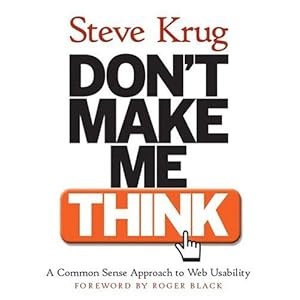
A great and very important design principle is the "don't make me think" rule. The purpose of this rule is to prevent people using the interface having to think about what to do next. Instead they should instantly know what button does what and how the interface works with out putting to much thought in to it. This design principle is commonly used n interface design world wide. A great example would be the basics of a phone and using it to call someone as the user instantly knows to put in the number and press the green button to call it. Still people grew up using phones so its common sense but with the touch screen, which is quite new. People knew how to use it straight away even if though it was there first time using it. This is because its touch screen so people knew to use there fingers and its only simple hand movements. For example users, with out thinking, knew to touch something in order to select it or drag there finger across the screen to change page. This is where the "don't make me think" rule was applied perfectly to the interface.
"I should be able to "get it"-what it is and how to use it-without expending any effort thinking about it." This was taken from Steve Krug's book don't make me think.

Consistency is another important design principle, which I shall be applying to my 3D soundtoy. This is so the people using my soundtoy would not have to keep learning each set of buttons, which would be frustrating. Using consistency users would be able to learn how to use my soundtoy quicker, so when the layout changes the user will not be stuck and wondering what to do next. As the same principles of interaction will be applied as its the same application. This principle works for tons of other devices and applications For example, video game consoles such as the Xbox 360. No matter the game, the users always knows that the A and the B button are the main buttons to navigate the menu. or with a shooting game, the user always knows that RT is the button you need to press to shoot.
"That’s what consistency in design is about. Get the routine, navigational stuff consistent so your audience can settle in, then you can have fun with the real stuff." This is quoted from and article by John Mcwade on design talk. I totally agree with this quote, by applying this principle to my 3D soundtoy I hope to make it easier to use and more enjoyable.


